Archive for August 2014
See, Think, Design, Produce: Randall Munroe’s Presentation
The last of the three STDP2 presentations I’ll review was by Randall Munroe, creator of the online comic xkcd. I’ve read xkcd for years and am constantly amazed at the quality of his work.
Munroe started out by noting that it’s ridiculously easy to get in your own way by trying to automate a process that can be done perfectly well by hand. As an example, consider a chart showing character interactions in the Star Wars or Lord of the Rings movies.
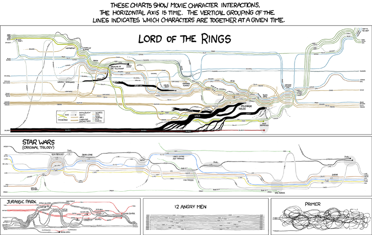
Original source: http://xkcd.com/657/
Gandalf’s a plot hack.
– Randall Munroe
Munroe said that he tried for ten years, off and on, to develop a tool that could translate a script into a character interaction timeline. Finally, frustrated, he drew the graph for the original Star Wars trilogy by hand in an hour. I imagine the timeline for 12 Angry Men took slightly less time to complete.
Displaying data is easy, Munroe argued, but determining which data to show is tough. That said, some presentation modes are better than others. Once he finds an angle he likes, he looks for other ways he can leverage that approach. Recently, he published a graphic on California droughts that uses the physical shape of the state as its axes. I’d love to see this design metaphor used in other graphics.

Original source: http://xkcd.com/1410/
He makes his infographics more palatable by adding humor, such as asides about a specific data point or a joke to indicate that, while he takes the analysis seriously, he doesn’t take himself too seriously. That approach lets him reveal that the Environmental Protection Agency assigns a human life an economic value of $8.2 million when performing cost-benefit analysis without inciting his readers.
Munroe came across as a soft-spoken, gentle person who is still slightly uncomfortable speaking in public. That said, his resolve strengthened when he discussed his wife’s cancer diagnosis and how he communicated the realities of treatment and survival rates. The image that resulted, “Lanes”, is one of the most powerful infographics I’ve encountered.

Original source: http://xkcd.com/931/
He didn’t want to leave us on such a somber note, so he concluded by showing us a graphic called “Lakes and Oceans” that he thought was interesting but nothing special. It shows the relative depths of various bodies of water and the ocean floor. He was surprised to discover it was one of the most popular things he published that year.
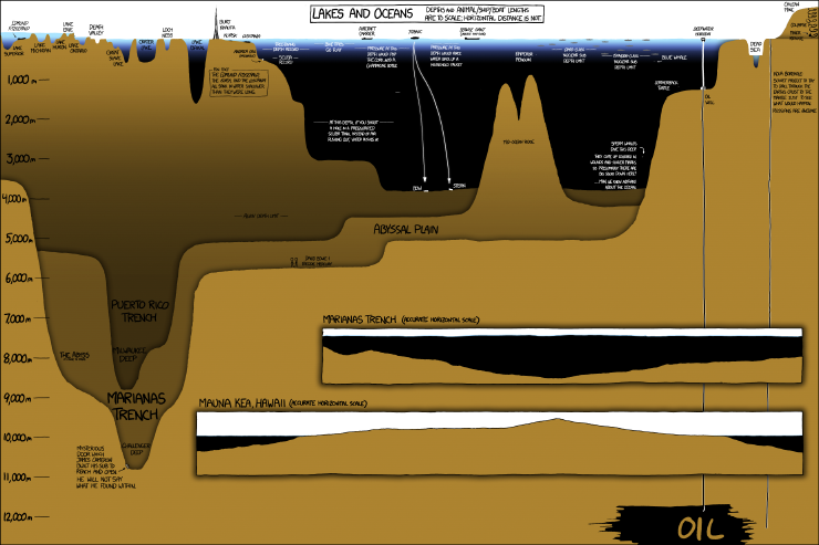
Original source: http://xkcd.com/1040/
I enjoyed my time in Seattle. The presentations by Jonathan Corum, Maria Popova, and Randall Munroe gave me a burst of energy that have let me approach my own work from a fresh perspective.
See, Think, Design, Produce: Jonathan Corum’s Presentation
We all have different ways of refreshing our perspectives and energies. I’m not a public person and don’t care much for gurus, but I saw the See, Think, Design, Produce seminar, organized by Edward Tufte and presented at the Westin Seattle on August 7, as a terrific opportunity to gain insights into leading professionals’ design thinking patterns.
The day’s program featured four speakers: Jonathan Corum from the New York Times; Maria Popova, curator of Brain Pickings; Randall Munroe, author of the xkcd online comic; and Edward Tufte, the design and communication guru. I got a lot out of the day — three of the four sessions were well worth my time and the other, unfortunately, reinforced criticism I’d heard from attendees of other events.
Jonathan Corum designs information visualizations for the New York Times. His work runs the gamut from seemingly simple graphics to full-on productions incorporating video and interactive web programming. He was first attracted to design work when he was quite young, when he used his pattern matching skills to see and recognize a person in the distance after a glance even though he couldn’t see that individual’s face. This event, as simple as it seems, eventually led him to see the possibilities of communicating by designing effective visualizations.
As an example, he showed illustrations from an Audubon Society book on bumblebees. The book’s graphics showed the pattern, variation, time, and location of numerous bumblebee species. The graphics were compact, easy to understand, and contained a lot of information. Corum moved onto thinking about visualizations, which in his case means sketching possible designs to communicate a concept, underlying data, or both. He emphasized that sketches are not commitments and showed a New York Times visualization that had gone through 265 iterations. “You try different things,” he said, “so that you can find something your brain recognizes, remember that aha moment, and communicate your understanding.”
Regarding design, he begged us to do more than collect and visualize trivia — whatever we display should add up to something and show meaningful patterns. As a data journalist (my term, not his), he emphasized that visualization does not equal explanation. We have to add an extra layer of explanation to be sure that our intended message gets across. When it comes time to produce a visualization, you have to learn to embrace the limitations of your medium and, in some cases, design the content to meet those restrictions.
Because video recordings of Olympic events are owned by the International Olympic Committee, for example, the New York Times had to display images of half-pipe snowboarders and downhill slalom skiers using a series of overlaid still photographs. Embracing that limitation resulted in a compelling composite image complete with callouts indicating the physical techniques the competitors used to execute a maneuver and set up for the next one.
Corum’s role as a journalist requires him to think of a broader audience, rather than just designing for an audience of one. It all comes down, he stated, to having respect for the reader or viewer, and to remember what it’s like to encounter a topic for the first time when you design a visualization.

You must be logged in to post a comment.